Fynd Rebranding

Fynd
2024-2025
Whole New Fynd
As Fynd expanded from a retail discovery platform into a multi-vertical commerce and tech ecosystem, its brand needed to reflect this growth. The rebranding was not just a visual refresh, but a strategic shift creating an identity that communicates clarity, cohesion, and the ambition to lead in a fast-evolving market.
BRANDING | VISUAL DESIGN | ILLUSTRATION | UI DESIGN

Problem
With multiple product verticals growing under the same umbrella, Fynd was starting to lose clarity in how it was perceived. There was confusion around what Fynd stood for, both internally and externally. Customers and users found it hard to associate individual products with the Fynd brand due to inconsistencies in design, communication, and overall approach. The lack of a unified system led to fragmented experiences making it difficult to build recognition, trust, and emotional connection with the brand.


Solution
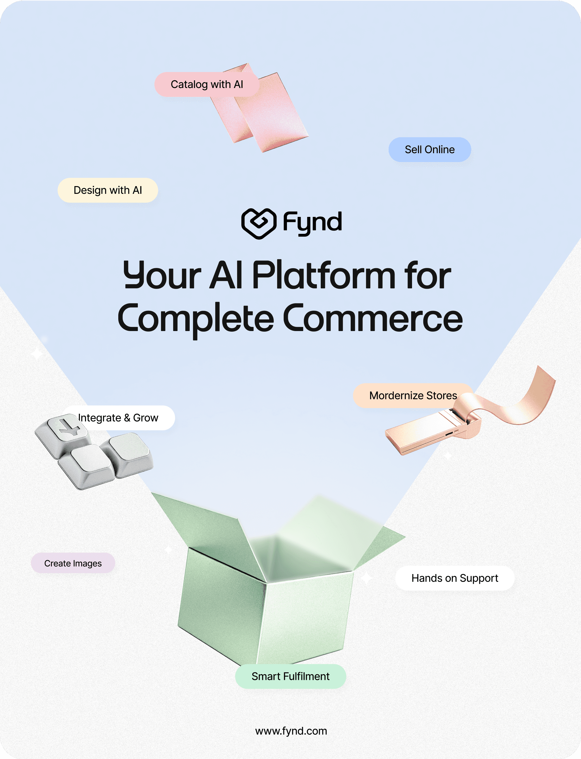
The rebrand aimed to unify Fynd’s diverse product portfolio under a cohesive, flexible system, guided by the new ethos: “We commit to care, and we innovate.” The focus was on building clarity, consistency, and a recognisable presence. Working with cross-functional teams, we simplified the logo, defined the visual direction, and created a scalable design system for seamless application across all platforms.
I contributed to creating the new logo, building the brand architecture, and developing the illustration style, translating the new ethos into a visual language that is both consistent and adaptable.
Brand Identity
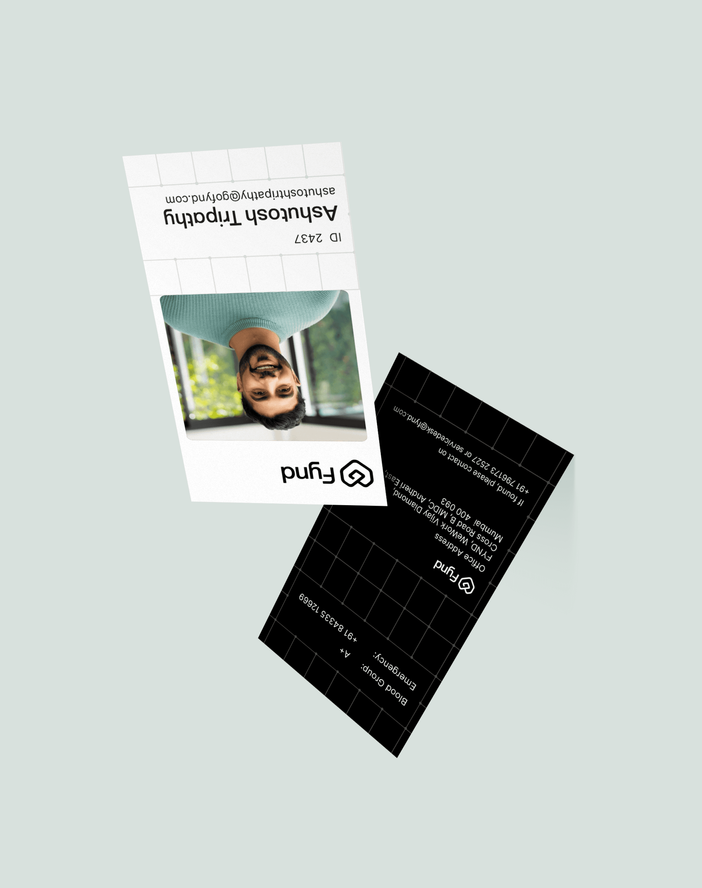
The rebrand began with simplifying the Fynd logo. The old mark was colourful and complex, which diluted clarity and didn’t align with the brand’s maturity. The new logo is minimal, geometric, and scalable retaining recognisability while projecting a modern, confident tone fit for both enterprise and consumer contexts.

Colour Palette
The Fynd colour palette is built to balance trust, innovation, and clarity while allowing flexibility across product verticals. The primary colours: blue, black, and white, form a modern, high-contrast foundation that conveys professionalism and reliability. The secondary palette is intentionally mapped to specific categories, with blue representing commerce, peach for in-store, green for operations and fulfillment, violet for Ai native, and grey for generic sectors like design, career and more. This approach creates a cohesive brand language while giving each product a distinct visual identity within the unified Fynd ecosystem
Illustration
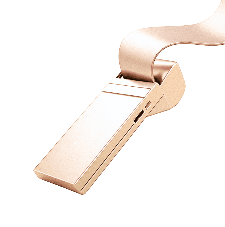
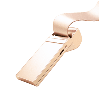
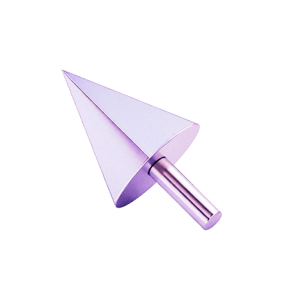
Minimal 3D metallic illustrations give an AI tech commerce company a futuristic, sleek, and high-end aesthetic, reinforcing innovation and sophistication. The metallic finish conveys precision and advanced technology, while the minimal design ensures clarity and modern appeal, making the brand look cutting-edge and trustworthy.

Applying the System
The new brand system was applied across all touchpoints—from product UIs and marketing campaigns to landing pages, internal tools, and partner decks—ensuring every interaction feels cohesive, recognisable, and distinctly Fynd


See Next
Harvest Edition 2025
© Meera Krishnadas 2025
/
linkendin
/
behance
Fynd Rebranding
Fynd
2024-2025
Whole New Fynd
As Fynd expanded from a retail discovery platform into a multi-vertical commerce and tech ecosystem, its brand needed to reflect this growth. The rebranding was not just a visual refresh, but a strategic shift creating an identity that communicates clarity, cohesion, and the ambition to lead in a fast-evolving market.
BRANDING | VISUAL DESIGN | ILLUSTRATION | UI DESIGN
Problem
With multiple product verticals growing under the same umbrella, Fynd was starting to lose clarity in how it was perceived. There was confusion around what Fynd stood for, both internally and externally. Customers and users found it hard to associate individual products with the Fynd brand due to inconsistencies in design, communication, and overall approach. The lack of a unified system led to fragmented experiences making it difficult to build recognition, trust, and emotional connection with the brand.
Solution
The rebrand aimed to unify Fynd’s diverse product portfolio under a cohesive, flexible system, guided by the new ethos: “We commit to care, and we innovate.” The focus was on building clarity, consistency, and a recognisable presence. Working with cross-functional teams, we simplified the logo, defined the visual direction, and created a scalable design system for seamless application across all platforms.
I contributed to creating the new logo, building the brand architecture, and developing the illustration style, translating the new ethos into a visual language that is both consistent and adaptable.
Brand Identity
The rebrand began with simplifying the Fynd logo. The old mark was colourful and complex, which diluted clarity and didn’t align with the brand’s maturity. The new logo is minimal, geometric, and scalable retaining recognisability while projecting a modern, confident tone fit for both enterprise and consumer contexts.

Fynd
Colour Palette
The Fynd colour palette is built to balance trust, innovation, and clarity while allowing flexibility across product verticals. The primary colours: blue, black, and white, form a modern, high-contrast foundation that conveys professionalism and reliability. The secondary palette is intentionally mapped to specific categories, with blue representing commerce, peach for in-store, green for operations and fulfillment, violet for Ai native, and grey for generic sectors like design, career and more. This approach creates a cohesive brand language while giving each product a distinct visual identity within the unified Fynd ecosystem


Online
Instore
Fulfillment
Extensions
Blue
RGB
r
35
g
136
B
255
HEX
#
D4E5FF
Peach
RGB
r
53
g
62
B
92
HEX
#
FCEADB
Green
RGB
r
53
g
62
B
92
HEX
#
C9EBD7

Ai Native
Violets
RGB
r
151
g
112
B
255
HEX
#
EEE8FC
Colour Palette
Black
RGB
r
35
g
136
B
255
HEX
#
00000
White
RGB
r
53
g
62
B
92
HEX
#
FFFFFF
Blue
RGB
r
25
g
36
B
71
HEX
#
3535F3

Generic
Silver
RGB
r
35
g
136
B
255
HEX
#
DEDEDE
Illustration
Minimal 3D metallic illustrations give an AI tech commerce company a futuristic, sleek, and high-end aesthetic, reinforcing innovation and sophistication. The metallic finish conveys precision and advanced technology, while the minimal design ensures clarity and modern appeal, making the brand look cutting-edge and trustworthy.


Website
Website
Website
Retailer
Brand/
Manufacturer
Brand/
Manufacturer
Brand/
Manufacturer
Distributor
Brand/
Manufacturer
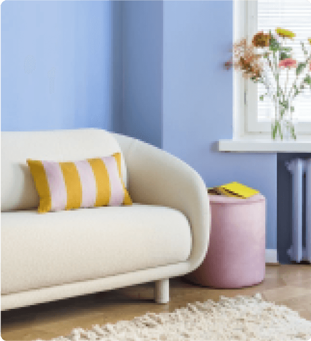
SHORT BOUCLE SOFA
₹ 5,950.00
MRP incl. of all taxes

Bobo armchair
Boba accent chair combining comfort with playful design.
Checkout
https://www.yourbrandwebsite.com/
Sales
₹ 21 K

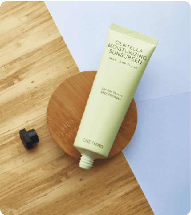
Sunscreen
Boba accent chair combining comfort with playful design.

ISO Certificate
SLSS
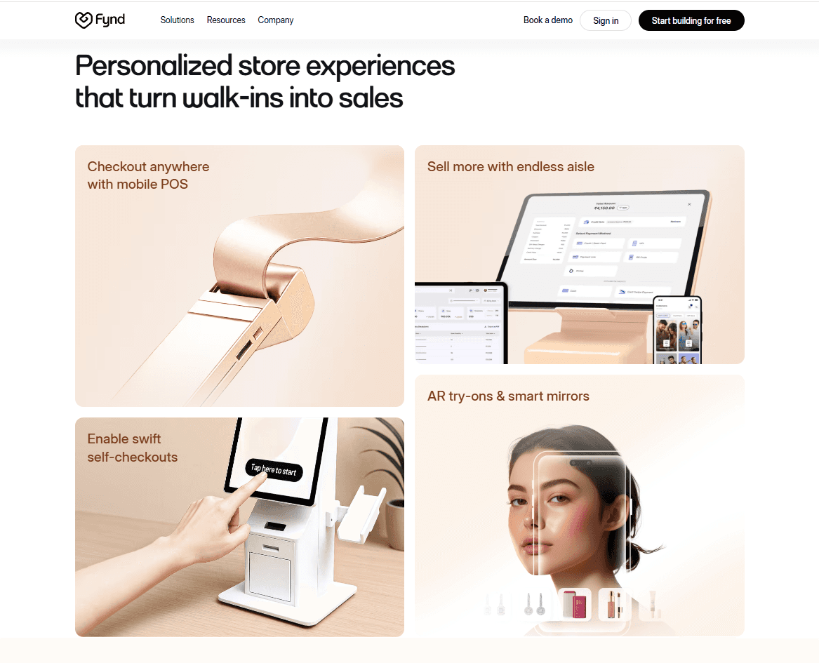
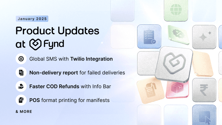
Applying the System
The new brand system was applied across all touchpoints from product UIs and marketing campaigns to landing pages, internal tools, and partner decks ensuring every interaction feels cohesive, recognisable, and distinctly Fynd


Fynd


See Next
© Meera Krishnadas 2025
/
linkendin
/
behance
Fynd Rebranding
Fynd
2024-2025
Whole New Fynd
As Fynd expanded from a retail discovery platform into a multi-vertical commerce and tech ecosystem, its brand needed to reflect this growth. The rebranding was not just a visual refresh, but a strategic shift creating an identity that communicates clarity, cohesion, and the ambition to lead in a fast-evolving market.
BRANDING | VISUAL DESIGN | ILLUSTRATION | UI DESIGN
Problem
With multiple product verticals growing under the same umbrella, Fynd was starting to lose clarity in how it was perceived. There was confusion around what Fynd stood for, both internally and externally. Customers and users found it hard to associate individual products with the Fynd brand due to inconsistencies in design, communication, and overall approach. The lack of a unified system led to fragmented experiences making it difficult to build recognition, trust, and emotional connection with the brand.
Solution
The rebrand aimed to unify Fynd’s diverse product portfolio under a cohesive, flexible system, guided by the new ethos: “We commit to care, and we innovate.” The focus was on building clarity, consistency, and a recognisable presence. Working with cross-functional teams, we simplified the logo, defined the visual direction, and created a scalable design system for seamless application across all platforms.
I contributed to creating the new logo, building the brand architecture, and developing the illustration style translating the new ethos into a visual language that is both consistent and adaptable.
Brand Identity
The rebrand began with simplifying the Fynd logo. The old mark was colourful and complex, which diluted clarity and didn’t align with the brand’s maturity. The new logo is minimal, geometric, and scalable retaining recognisability while projecting a modern, confident tone fit for both enterprise and consumer contexts.
Colour Palette
The Fynd colour palette is built to balance trust, innovation, and clarity while allowing flexibility across product verticals. The primary colours: blue, black, and white, form a modern, high-contrast foundation that conveys professionalism and reliability. The secondary palette is intentionally mapped to specific categories, with blue representing commerce, peach for in-store, green for operations and fulfillment, violet for Ai native, and grey for generic sectors like design, career and more. This approach creates a cohesive brand language while giving each product a distinct visual identity within the unified Fynd ecosystem
Illustration
Minimal 3D metallic illustrations give an AI tech commerce company a futuristic, sleek, and high-end aesthetic, reinforcing innovation and sophistication. The metallic finish conveys precision and advanced technology, while the minimal design ensures clarity and modern appeal, making the brand look cutting-edge and trustworthy.
See Next
Harvest Edition 2025
© Meera Krishnadas 2025